Typography: Exercises

01/04/19-03/05/19 (Week 1-Week 5)
Angelina Lee An Qi (0334272)
Typography
Exercises
Lecture Notes
Lecture 1: Introduction to the moduleWeek 1 (05/04/19):
We were briefed on what is expected of us during the next 14 weeks, at the same time was taught on how to format our blogs and customize it. We were also to provide 10 different lettering for our names that embodies our characteristics.
Lecture 2: The Evolution of Typography
Week 2 (12/04/19):Typography is expressive fonts and text that communicates an effective message. When we see a design, try to analyze that design. (Visual analysis) Terminologies in typography are necessary to evaluate others' works. Logo - Word mark or logo type.
To understand what looks good or bad in typography, it takes time, trial and error. Calligraphy > Lettering > Typography (Over 500 years) PAUL RAND Wikipedia describes typography as "the art of arranging type to make written language legible, readable, and appealing when displayed. The arrangement of type involves selecting typefaces, point size, line length, line-spacing (leading), and letter-spacing (tracking), and adjusting the space between pairs of letters." The democratization of typography as in the decline of skilled typographers because of modern applications. In the past, people assume how educated you are through your writing. If your writing is neat and clean, you are considered well-educated.
Font - derived from the word 'foundry' which is a place that melts/casts led/metal. It refers to the process of making or casting font at a foundry. The first successful cast of a letter was done in Korea.
Typeface - individual type or weight within the typeface. Examples are Georgia Regular, Georgia Italic and Georgia Bold.
Type family - A type family refers to the entire family of fonts that share similar characteristics. Examples are Georgia, Arial, Times New Roman, Didot and Futura.
Adrian Frutiger designed the Frutiger typeface. Areas we will cover in this semester: type creation, type expression and type arrangement.
Lecture 3: Letterforms
Week 3 (19/04/19):Typography terminology:-
Baseline: The imaginary line the visual base of letterforms.
Median: Defining the x-height of letterforms.
X-height: The height in any typeface of the lowercase X.
Stroke: The main diagonal portion of a letterform.
Apex/Vertex: The point created for joining two diagonal lines.
Arm: Short strokes off the stem of the letterform, either horizontal or inclined.
Ascender: The portion of the stem of a lowercase letterform that projects the above median.
Beak: The half sent finish on some horizontal arms.
Bowl: The rounded form between the serif and the stem.
Descender: The portion of the stem that projects the baseline.
Em/en: Originally referred to the width of the uppercase M, and em is now the distance equal to the size of the typeface. En is the half size of em, mostly describe as em/en spaces and em/en dashes.
Ligature: Character formed by the combination of two or more letterforms.
Spine: Mid-section of the S.
Stress: The orientation of the letterform, indicated by thin strokes in round forms.
Swash: The flourish that extends the stroke of the letterforms.
Lecture 4: Development/Timeline of Typography
Week 4 (26/04/19):I was not able to attend this lecture so I did some personal research as well as read through the slides Mr Vinod gave us.
1800 BC: The typographical principle, that is the creation of a complete text be reusing identical characters, is first realized in the Phaistos Disc, an enigmatic Minoan print item from Ctrete, Greece, which dates between 1850 and 1600 BC.
1200 BC: The Phoenicians gain independence from the Egyptians and develop their own alphabet, the first to be composed exclusively of letters.
732: Charelemagne orders a system of writing called the Caroline miniscule which had the first versions of lowercase letters that were not just small versions of uppercase letters.
1440: Typography, type-founding, and typeface design begin as closely related crafts in mid-15th century Europe due to the introduction of movable type printing at the junction of the medieval era and the Renaissance. Handwritten letterforms of the mid-15th century embodied 3000 years of evolved letter design, and were the natural models for letterforms in systematized typography. The scribal letter known as textur or textualis, produced from the hands of German area scribes, served as the model for the first text types.
1455: Johannes Gutenberg employs the scribe Peter Schoffer to help design and cut the letterpunches for the first typeface--the D-K type of 202 characters used to print the first books in Europe.
1474: The rapid spread of movable type printing across Europe produces additional Gothicm half-Gothic and Gothic-to-Roman transitional types. Johann Bamler's Schwabacher, Augsburg appears.
1476: In 1476 William Caxton prints the first books in England with a so-called Batarde type (an early Schwabacher design), but soon abandons the process.
1490: Claude Garamond from France develops the first true printing typeface not designed to imitate handwriting, but instead draws on rigid geometric principles. Garamond also begins the tradition of naming the typeface after himself.
1500: A printer by the name of Aldus Manutius invents the concept of pocket or portable books. In addition, he also creates the first Italic typeface (one of the first typeface variations).
1557: In order to simulate handwriting, Robert Granjon develops the first cursive typeface.
1734: William Caslon issues a typeface (bearing his name) which includes straighter serifs and grater contrast between the major and minor strokes.
1757: The first transitional roman typeface is introduced by John Baskerville. This typeface increased the contrast between thick and thin strokes, had a nearly veritcal stress in the counters, as well as very sharp serifs.
1780: Firmin Didot and Giambattista Bodoni of Italy develop the first modern romans. The moderns carry the transitionals to the extreme: thin strokes can be describe as hairlines and they have a fully vertical stress.
1815: Vincent Figgins designs a typeface with square serifs--these later become known as slab serifs.
1816: William Caslon IV produces the first typeface without serifs of any kind, however this sans serif style is ridiculed at the time.
1920: In addition to creating the Broadway typeface, Frederic Goudy develops several other innovative designs and becomes the world's first full-time type designer.
1925: Herbert Bayer is appointed the new head of a newly created workshop for print and advertising at the Dessau Bauhau. It is here that he designs universal typefaces which are later adapted into Bauhaus fonts.
1931: 'The Times' newspaper commisions Stanley Morison to produce a new easy-to-read typeface for their publication--Times New Roman.
1954: A Swiss artist, Max Miedinger, creates Helvetica. He is also the first designer to champion the use of white space as a design element.
1955: Howard Kettler designs Courier for IBM; which becomes the most popular typeface used on typewriters for 30 years.
1964: The first digital typesetter (Digiset) is invented by Rodolf Hell and used to produce the first digital font, Digital Grotesk.
1985: Adobe invents Postscript: the system which uses mathematical calculations to describe typefaces versus relying on pixel by pixel definitions of fonts.
1989: Apple and Microsoft reject Adobe's offer of Postscript and begin a joint project to create their own font technology called Truetype. Although Truetype is not as clean or reliable as Postscript, its creation allowed for an explosion in font design.
1996: OpenType, a cross-platform font file format, is developed jointly by Adobe and Microsoft. Besides being supported by multiple platforms, it also supported expanded character sets and layout features. Also, Matthew Carter designs Verdana and Georgia for Microsoft. Both fonts proved to retain their legibility even at very small sizes on a screen.
[source: K. Hunnel, Amy 2012 https://visual.ly/community/infographic/history/history-typography-timeline]
Lecture 5: Letters
Week 5 (03/05/19): Some letters may not need to be mathematically accurate to be optically pleasing.The basic principles of design apply directly to typography. The reason why we use contrast is to set a hierachy of information.
"On the streets, you look at girls [or boys]. I look at type." - Hannes von Dohren.
Instructions
Exercises
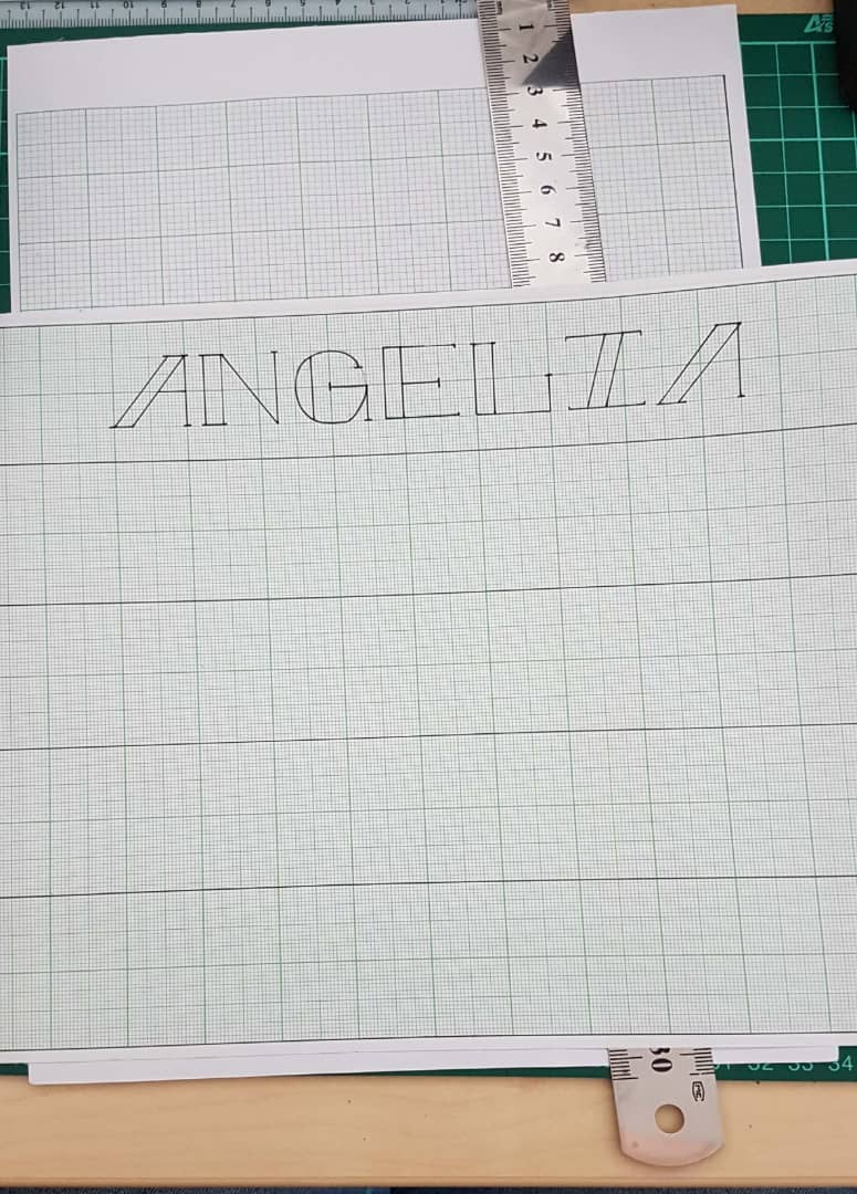
Week 2: Lettering
 |
| Fig. 1.1 These were the sketches for the lettering of my name. |
I divided the graph paper into five sections horizontally, both because my name is too long and because only then it can be equally divided into two graph papers. I threw away this first paper because I spelt my name wrong and I overestimated myself by using a pen.
 |
| Fig. 1.2 |
 |
| Fig. 1.3 |
 | |
| Fig. 1.4 Graph Paper 1 |
I made a mistake on lettering 9 on the 'G' because I accidentally made the pencil sketch like that as well.
 |
| Fig. 1.5 Graph Paper 2 |
I tried to develop a bit more for lettering 1 to make it a little more interesting, so, for now, I will use this lettering 11.
Week 3: Digitalize Lettering
 |
| Fig. 2.1 I digitalized my lettering with Adobe Illustrator. |
Week 4: Animating
We did a short animation for our lettering using Illustrator and Photoshop.
This is a process video showcasing all the 22 frames:
This second video is how the animation goes while showcasing all the frames.
 | ||
| Fig. 3.1 This is the result of my first attempt. |
This third video is of me during the process of me working on a second attempt after feedback from Mr Vinod.
 |
| Fig. 3.2 This is the result of my second attempt. |
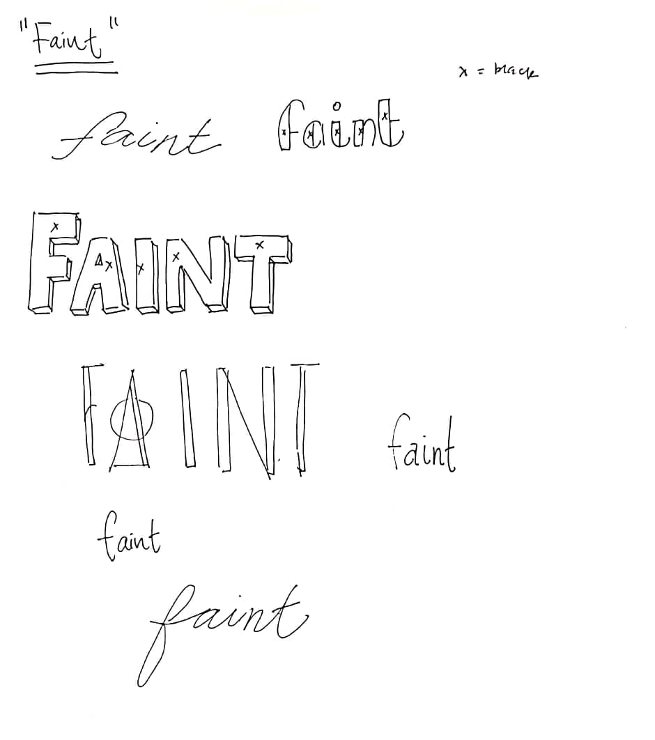
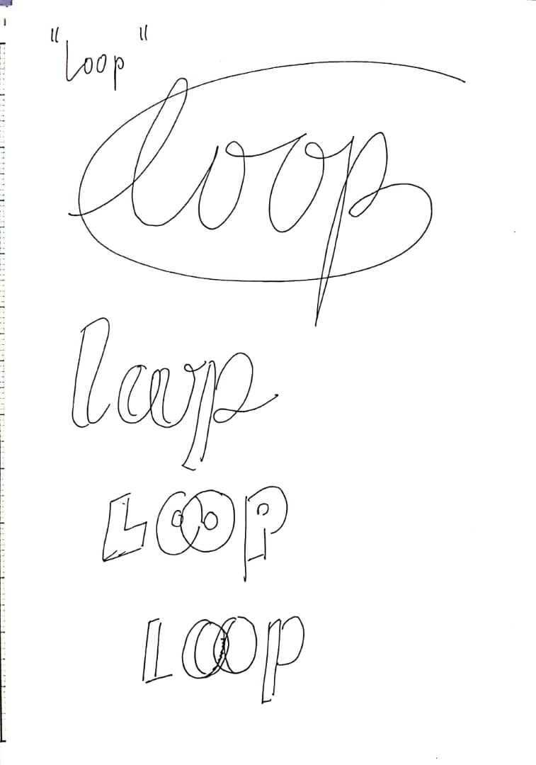
Week 5: Designing Letterings for 6 Words
We were given 7 words, Freeze, Faint, Loop, Bounce, Angry, Hungry, and Levitate. I chose to leave out Hungry. I started with some sketches for each word I chose:
 |
| Fig. 4.1 |
 |
| Fig. 4.2 |
 |
| Fig. 4.3 |
 |
| Fig. 4.4 |
 |
| Fig. 4.5 |
 |
| Fig. 4.6 |
 |
| Fig. 4.7 I went ahead and used graph paper to brush up my sketches. |
 |
| Fig. 4.8 |
I originally thought that we had to produce 6 animations of our chosen words by the end of this week, but I've heard from my friends that we were required to digitize them.
 |
| Fig. 5.1 I did Faint first. |
 |
| Fig. 5.2 |
I did it in red and animated it this way because I wanted to give off the effect of a person's heart beating rapidly and then suddenly flatlining, as if having a heart attack. I still have yet to digitize the other words.
 |
| Fig. 5.3 |
 | |
| Fig. 5.4 |
 | |
| Fig. 5.5 |
 | |
| Fig. 5.6 |
 | |
| Fig. 5.7 |
Feedback
Week 1:We were given our first exercise this week, so there wasn't any feedback.
Week 2:
Mr Vinod said for me to choose just one characteristic of myself and develop it. I misunderstood the exercise at first thinking that I had to think of 10 different characteristics and make 10 different letterings from that. So now, I pick 'stability' as a characteristic. Mr Vinod asked me, "What is the most stable shape?" and I answered "Square." and he advised me to develop my lettering from there. I will be continuing from lettering 1 as I feel like it is the most square-shaped lettering out of the 10.
Week 3:
Mr Vinod suggested that I make the thicker lines of my lettering gradually form like the thinner lines.
Week 4:
I was absent for this class so I did not receive any feedback. On Facebook however Mr Vinod asked me to update my blog link.
Week 5:
Mr Vinod said that my Faint animation is fine, however he thinks that the letters should be moving one by one, not in unison like what I did, otherwise it looks kind of awkward.
Reflections
Experience:
Week 1: I sketched out around 15 or 16 types of lettering and I picked out 10. I wanted to do more, but when I estimated how much time I had, I had to stop myself there.Week 2: I felt kind of disappointed when Mr Vinod said to switch from WordPress to Blogger for our e-portfolio. However, his comments on my work are very helpful.
Week 3: I thought the animating process to be very tedious.
Week 4: I found it quite stressful to complete 6 animations by the end of the week. I didn't know that we just had to digitize them.
Week 5: I felt kind of tired but not as overwhelmed as before. Now we have to start work on our first project.
Observations:
Week 1: I did the lettering exercise horizontally, or in a landscape format, so that I am able to equally divide into 5 letterings for 2 graph papers. I had a small lettering mistake in graph paper 2.Week 2: Quite a number of my classmates has not worked much on their blogs at this point of time.
Week 3: My animations are a bit choppy.
Week 4: I misunderstood Mr Vinod's instructions. I thought that we had to produce 6 animations of our chosen words by the end of this week, but I've heard from my friends that we were required to digitize them.
Week 5: My progress on my work is a bit too slow.
Findings:
Week 1: I found so many interesting types of lettering. I also found out how it can be somewhat tough to find several lettering that suits me.Week 2: I don't have a strong grasp in Adobe Illustrator. I have a lot of mistakes in my work and I need to remind myself to double check the sketch before proceeding to line it.
Week 3: I have to make more frames for my other animations.
Week 4: I was not able to finish all of the digitizations and have to make up for it.
Week 5: I will have to free up more time to work on the digitizations and the first project.
Further Reading
Week 2 (12/04/2019):
Design for Communication Conceptual Graphic Design Basics by Elizabeth Resnick
 |
| Fig. 7.1 |
 |
| Fig. 7.2 |
Since it is week 1, I decided to focus on the meaning of typography itself before proceeding to the ins-and-outs of it. I am basing my passage of this book on a particular section 2, which describes typography as an image. Typography, in simple terms, is the mastery of type design.
As quoted from Willi Kunz, "Typographic design is both process and product--a creative combination of the communication practice and aesthetic theory. It begins with the selection and arrangement of typographic elements to communicate a message, and it ends with the composition in two-dimensional spaces."
Phil Baines also said that "Typography is the mechanical notation and arrangement of language that is used to make multiple copies whether by printed or electronic means."
Seeing how other people describe it gives me a sense of general understanding as well. It is fascinating learning about a certain topic through others' eyes.
Week 3 (19/04/19):
Letterwork Creative Letterforms in Graphic Design by Leonard Currie and David Quay
 |
| Fig. 8.1 |
 |
| Fig. 8.2 |
For this week, I decided to focus on the Lettering and Typography section, which mentions how lettering and typography coexists. The characteristics of letterforms that are capable of manipulation are:
- shape
- weight
- size
- slope
- colour
- texture
- edge
- entasis (gradual thickening or thinning of the main parts of letters)
- serifs
- decorative elements (dropped shadows and in-lines)
All of these elements can be adapted to sit well with a certain typeface as well as having the ability to convey a specific message.
Week 4 (26/04/19):
WHAT IS GRAPHIC DESIGN FOR? by Alice Twemlow
 |
| Fig. 9.1 |
 |
| Fig. 9.2 |
 |
| Fig. 9.3 |
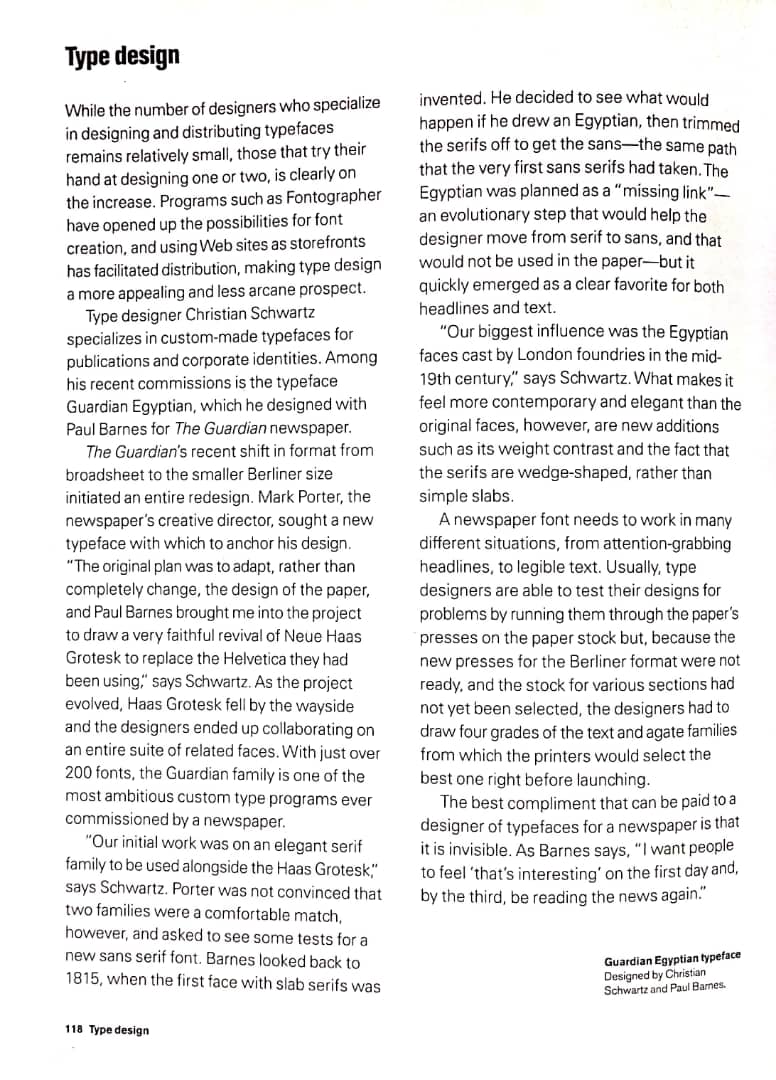
I turned to a specific part of the book titled Type Design, on page 118. "Type designer Christian Schwartz specialises in custom-made typefaces for publications and corporate identities. Among his recent commissions is the typeface Guardian Egyptian, which he designed for The Guardian newspaper..."
"...The original plan was to adapt, rather than completely change, the design of the paper, and Paul Barnes brought me into the project to draw a very faithful revival of Neue Haas Grotesk to replace the Helvetica they had been using..."
"...Our biggest influence was the Egyptian faces cast by London foundries in the mid-19th century...""...A newspaper font needs to work in many different situations, from attention-grabbing headlines, to legible text. Usually, type designers are able to test their designs for problems by running them through the paper's stock but, because the new presses for the Berliner format were not ready, and the stock for various sections had not yet been selected, the designers had to draw four grades of the text and agate families from which the printers would select the best one right before launching..."
I feel like this is a good example of what is expected of type designers and what they are being commissioned for. Previously I was not that sure on what they do, so through this reading I have gained a little bit more insight into what people in type design have to handle.
Week 5 (03/05/19):
Typographic Design in the Design Studio Design Concepts by David A. Amdur
 |
| Fig. 10.1 |


Comments
Post a Comment