26/08/19-23/09/19 (Week 1-Week 5)
Angelina Lee An Qi (0334272)
Advanced Typography
Exercises
Lecture Notes
Lecture 1: The 8 Typographical Systems
Week 1 (26/08/19):
There is a total of 8 typographical systems:
- Axial
- Radial
- Dilatational
- Random
- Grid
- Modular
- Transitional
- Bilateral
My group was assigned to research on transitional and bilateral systems. I was helping with the bilateral system. We compiled it into presentation slides.
Fig. 1.1 to Fig. 1.5 was found
here.
 |
| Fig. 1.1 Example of Bilateral sketches. |
 |
| Fig. 1.2 Example of moving text horizontally/vertically. |
|
 |
| Fig.1.3 Example of grouping text. |
 |
| Fig. 1.4 Example of tilting text. |
 |
| Fig. 1.5 Example of adding objective elements. |
 |
| Fig. 1.6 Example of a Bilateral design. |
 |
| Fig. 1.7 Example of a Bilateral design. |
Lecture 2: Type & Play: Part 1
Week 2 (02/09/19):
We were instructed to find an image (cracks on the road, shattered glass, etc.) and derive five letters from it. For this week we are required to outline the image and find any five letters, and then decide on an end point with the 9 typefaces Mr Vinod gave us. We are to find a middle ground between the letters from the image we found and a typeface of our choice.
Lecture 3: Type & Play: Part 2
Week 3 (09/09/19):
Image of a man-made structure, object or nature will be combined with a letter, word or sentence. The text must have a correlation (symbolic) to the image. Come up with a headline, i.e. 'swift' with a person running (showing movement).
Try to understand the energy and movement of an image. Need to increase the intimacy between text and image, like they have become one. They play with one another.
Lecture 4:
Week 4 (16/09/19): We had no class during this week due to holiday.
Instructions
Exercises
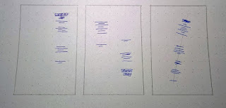
Week 1: Exploration of The 8 Typographical Systems
We were required to research the typographical systems and give a presentation. For this, we were divided into four groups. My group was assigned to research the bilateral and transitional systems, so we collaborated with each other and did our
presentation slides on Google Slides.
For our first exercise (this time it is individual work) we were to explore all of the 8 typographical systems and create two spreads of each system, totaling to 16 spreads.
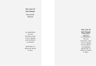
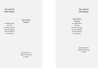
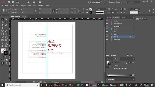
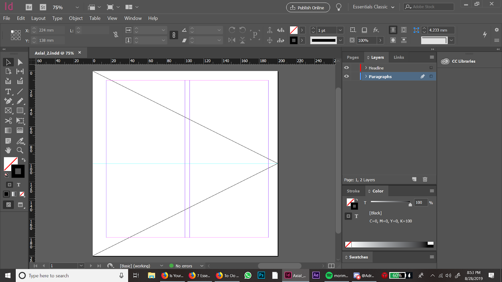
Axial
 |
| Fig. 2.1 Layout |
 |
| Fig. 2.2 |
 |
| Fig. 2.3 |
 |
| Fig. 2.4 Layout |
 |
| Fig. 2.5 |
 |
| Fig. 2.6 |
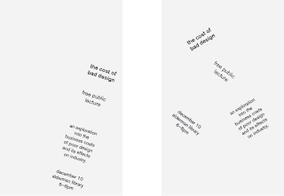
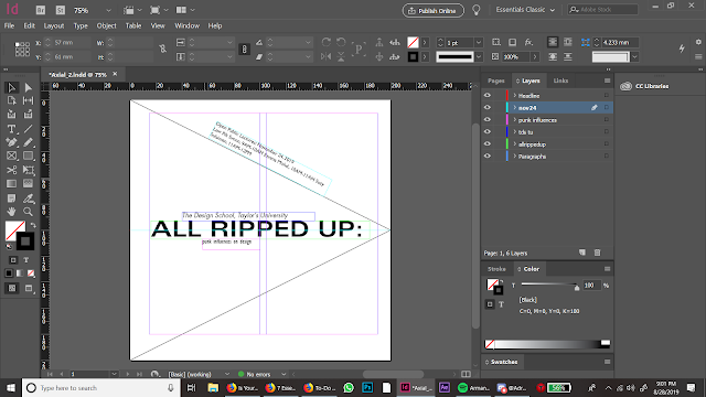
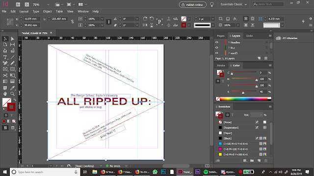
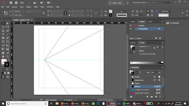
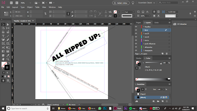
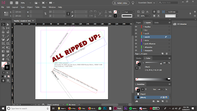
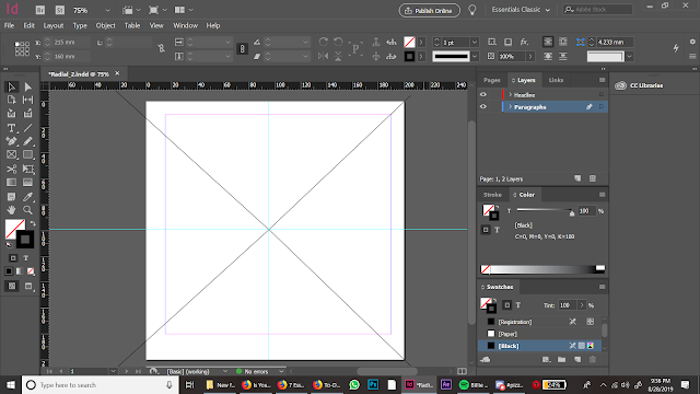
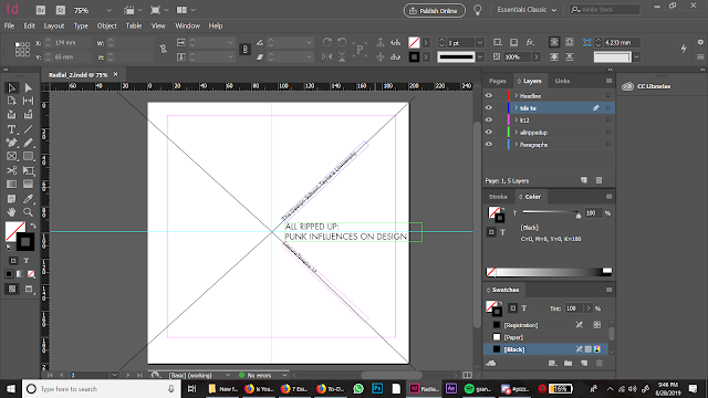
Radial
 |
| Fig. 3.1 Layout |
 |
| Fig. 3.2 |
 |
| Fig. 3.3 |
 |
| Fig. 3.4 Layout |
 |
| Fig. 3.5 |
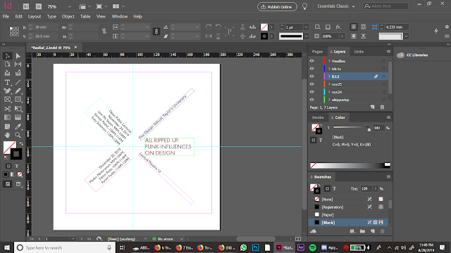 |
| Fig. 3.6 |
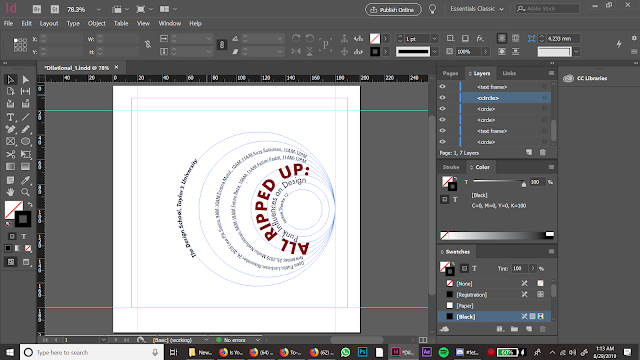
Dilatational
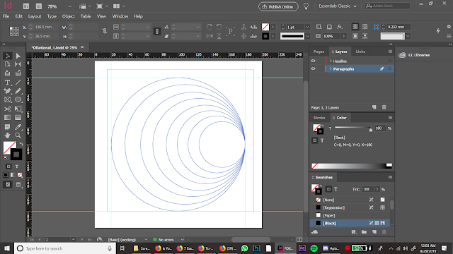 |
| Fig. 4.1 Layout |
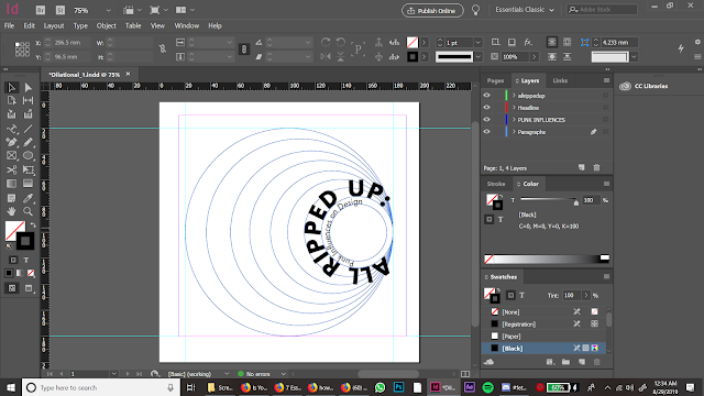 |
| Fig. 4.2 |
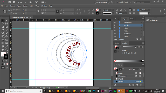 |
| Fig. 4.3 |
 |
| Fig. 4.4 |
 |
| Fig. 4.5 |
 |
| Fig. 4.6 |
 |
| Fig. 4.7 |
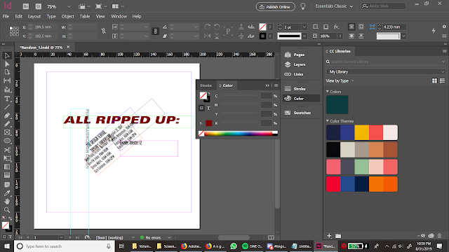
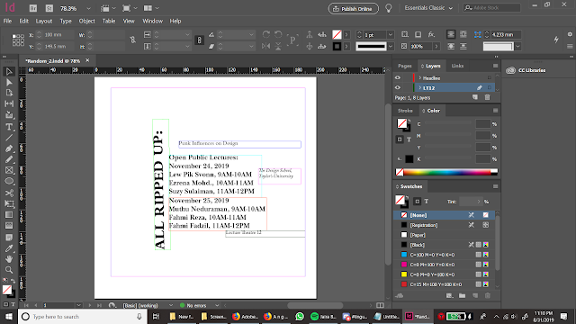
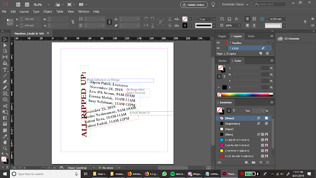
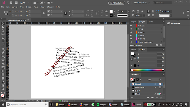
Random
 |
| Fig. 5.1 |
 |
| Fig. 5.2 |
 |
| Fig. 5.3 |
 |
| Fig. 5.4 |
 |
| Fig. 5.5 |
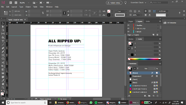
Grid
 |
| Fig. 6.1 Layout |
 |
| Fig. 6.2 |
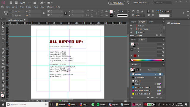 |
| Fig. 6.3 |
 |
| Fig. 6.4 |
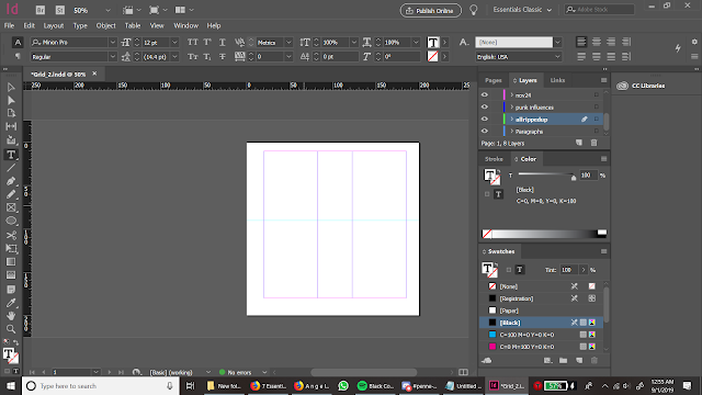 |
| Fig. 6.5 Layout |
 |
| Fig. 6.6 |
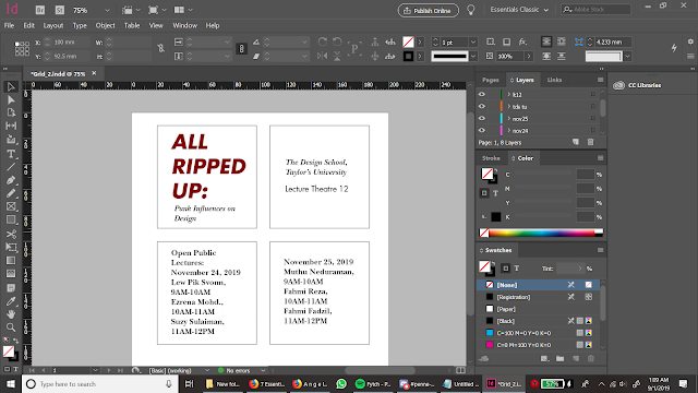 |
| Fig. 6.7 |
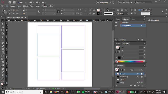
Modular
 |
| Fig. 7.1 |
 |
| Fig. 7.2 |
 |
| Fig. 7.3 |
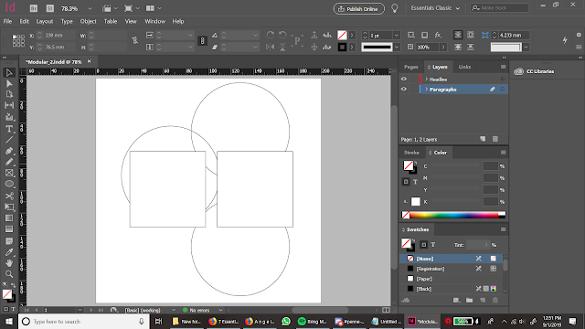 |
| Fig. 7.4 Layout |
 |
| Fig. 7.5 |
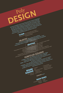
Transitional
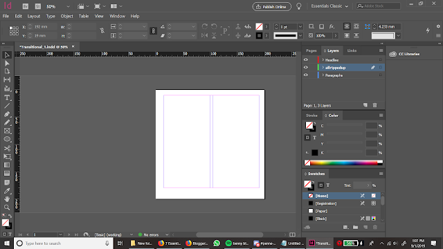 |
| Fig. 8.1 Layout |
 |
| Fig. 8.2 |
 |
| Fig. 8.3 |
 |
| Fig. 8.4 |
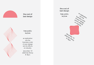
Bilateral
 |
| Fig. 9.1 |
 |
| Fig. 9.2 Layout |
 |
| Fig. 9.3 |
 |
| Fig. 9.4 |
Week 2:
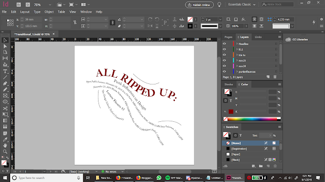
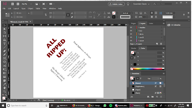
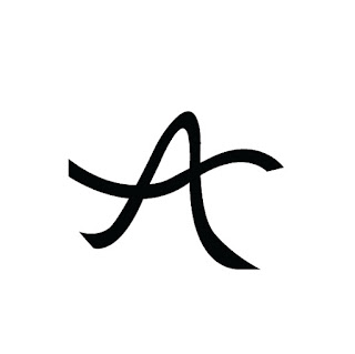
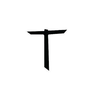
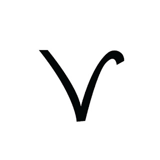
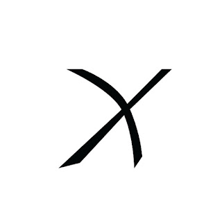
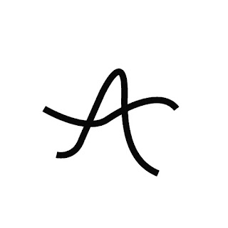
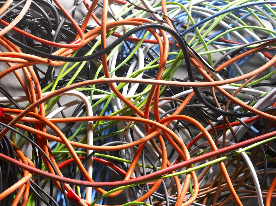
I used a picture of tangled wires to find my letters. The letters I found were Y, A, T, V, and X. Then I used the typeface Univers LT Std Bold Extended as my end point, and I refined to find a middle ground.
 |
| Fig. 11.1 The picture I used to find my letters. |
 |
| Fig. 13.1 Draft 2 |
 |
| Fig. 13.2 Draft 2 |
 |
| Fig. 13.3 Draft 2 |
 |
| Fig. 13.4 Draft 2 |
 |
| Fig. 13.5 Draft 2 |
Week 3:
 |
| Fig. 14.1 A Final |
 |
| Fig. 14.2 T Final |
 |
| Fig. 14.3 V Final |
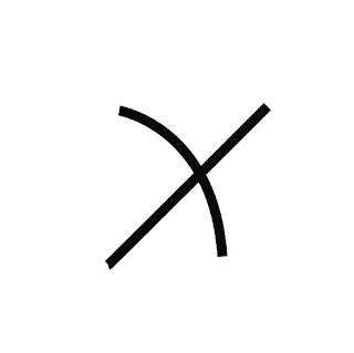 |
| Fig. 14.4 X Final |
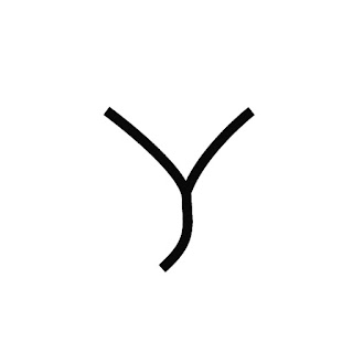 |
| Fig. 14.5 Y Final |
Week 4:
 |
| Fig. 15.1 |
 |
| Fig. 15.2 |
 |
| Fig. 15.3 |
 |
| Fig. 15.4 |
 |
| Fig. 15.5 |
 |
Fig. 15.6 I wanted to use this as my final result at first, but Mr Vinod commented that I should make the image have a more intimate relationship with the text.
|
 |
| Fig. 16.1 |
 |
| Fig. 16.2 |
 |
| Fig. 16.3 Final |
Feedback
Week 1: We were given our first exercise this week, so there wasn't any feedback.
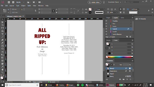
Week 2: Mr Vinod mentioned that I tend to centralize my designs, and that sometimes I leave too much space around it. He also suggested that with text like "9AM" if the body text size is 9, then I can reduce the size of "AM" to 8.5.
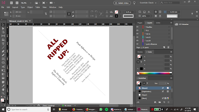
Week 3: I was told to try and keep the flow of the wire. Instead of rounding the ends like I did in my first draft, I sharpen it. Mr Vinod also told me to just make the strokes even.
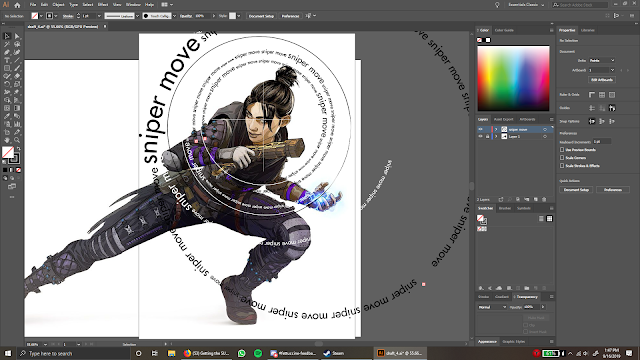
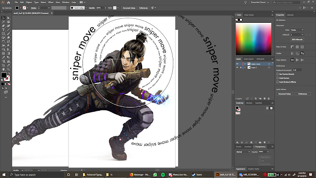
Week 4: Mr Vinod's message on Facebook: "I can see you are trying to make the text interact with the image. You however need to focus on the key line (Sniper Move) and make it work in an intimate way with the visual. Look at the examples given, study it. Then look at your image study it, where could you integrate you key words Sniper Move looking the energy of the pose, where the illustration is looking etc. Presently the lots of text is ok, but is also disturbing. You need to focus on the key words and use that and integrate the text intimately with the image."
Week 5: Mr Vinod said that my exercise 2 part 2 was pretty basic. He also commented on my letters saying that I should improve them further and refine the edges of them.
Reflections
Experience:
Week 1: The presentations we had to do in class felt very helpful to me. I think it was because I was active in the research process that I was able to understand the typographical systems better. Although when listening to the other presentations did not exactly process in my mind completely, I was able to reference from my own research and compare it with the other typographical systems.
Week 2: When I was working on Exercise 1, I created individual files for each of my designs. It made things harder for me to click in and out of different files. I should remember to create a single file with multiple spreads.
As I was working on Exercise 2, however, I still have not learnt my lesson and still saved my designs into individual files. At the time I am writing this, I still have time to compile everything into one file, so I will do just that.
Week 3: I refined my letters for the last time this week. I just made all my lines the same thickness. I did not realize that I could do that at first--but when Mr Vinod gave me feedback last week, he mentioned that.
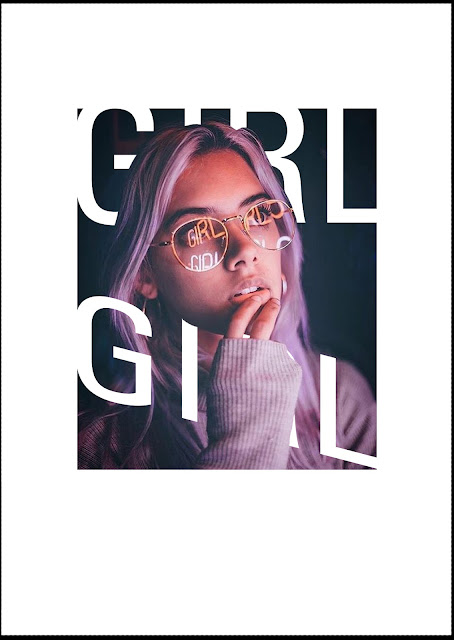
Week 4: I was unsure of what to do at first. I knew that I had to intertwine type and image together, and I have seen many examples of it, but when I did my first design I felt like I did not fully understand it yet. I searched for other images I can worked with, and I stumbled upon the picture of the girl, so I put 'girl' as my word and tried to mix it together.
Observations:
Week 1: I struggled quite a fair bit with the systems that have a lot to do with curves, like the dilatational system and the transitional system. It was not so bad with the radial system, but it still took a while to get used to.
Week 2: I still have bad habits like saving everything into different files, so I will have to constantly remind myself about it and be more aware of what I am doing. I also have a tendency to leave everything for the last minute, so I need to work on my time management a lot more as well.
Week 3:I did not think that I could make my letters the same thickness. I thought that I had to manually do that myself.
Week 4: I don't think I fully understood what to do. I thought that I had to integrate some of the typographical systems we learnt a few weeks earlier.
Findings:
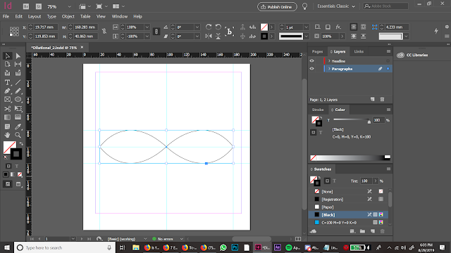
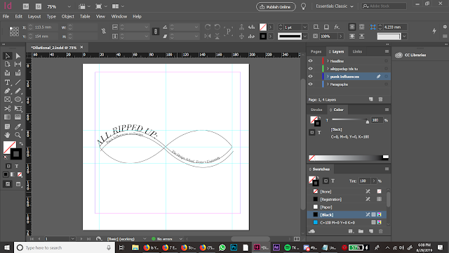
Week 1: I found that there is a type on a path tool in InDesign. All I had to do was create a curved line and, using the type on a path tool, click on the line and suddenly I am able to put the text on a curve. To remove the line I changed the stroke size of the path to 0.
Week 2: I find it quite hard to break my habits. It feels so ingrained in me because I felt comfortable doing it during my foundation and the first semester of my degree, but I have realized that it is not the proper way to go about completing my assignments, so I have to find ways to counteract that.
Week 3: I found out that I could. I am aware that technology technically makes things easier for us, but I still bring up habits from when I work with traditional media.
Week 4: Once I got feedback from Mr Vinod and searched for more examples, I think I was able to understand what I had to do better. I felt like it was an easier task when I did my second design.
Further Reading
Week 2:
Design Elements: Typography Fundamentals by Kristin Cullen
 |
| Fig. 17.1 The book cover |
 |
| Fig. 17.2 |
 |
| Fig. 17.3 |
 |
| Fig. 17.4 |
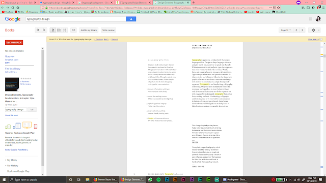
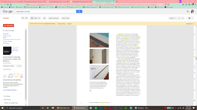
Typography lets designers give life to words and combine semantic and aesthetic. It is not the same as handwriting, calligraphy, and lettering. Those three are most commonly reserved for customized work.
There are two approaches to typographic design: macrotypography and microtypography. Macrotypography is the planning of the layout of typographical design elements. "It is the first impression that engages viewers."
Microtypography is the details of typesetting. Individual letterforms, words, lines, and paragraph dynamics need to be tweaked on its own. This ensures more refined designs.
Typefaces are the core of visual communication.
Week 4:
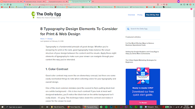
8 Typographical Design Elements to Consider For Print & Web Design by The Daily Egg
 |
| Fig. 18.1 The blog |
 |
| Fig. 18.2 Color contrast |
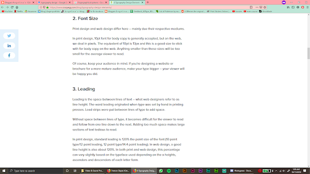 |
| Fig. 18.3 Font size and leading |
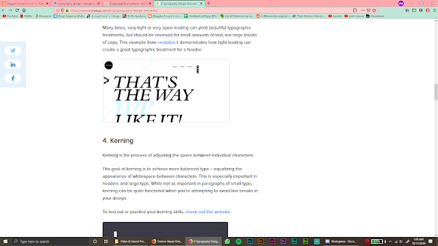 |
| Fig. 18.4 Kerning |
 |
| Fig. 18.5 Hierarchy |
 |
| Fig. 18.6 Whitespace |
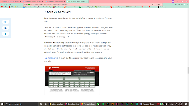 |
| Fig. 18.7 Serif vs. Sans Serif |
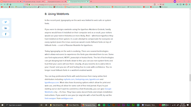 |
| Fig. 18.8 Using Webfonts |
Contrast, font size, leading, kerning, hierarchy, whitespace, serif vs. sans serif, using webfonts. These are all essential in making an effective typographical design. They all play a role in tying the whole design together.
I find that, while reading through this, reminded me of what I should always keep in mind when working on my assignments.


Comments
Post a Comment