Typography: Project 2: Font Design

17/05/19-14/06/19 (Week 7-11)
Angelina Lee An Qi (0334272)
Typography
Project 2: Font Design
Lecture Notes
Lecture 7:
Kerning is the automatic adjustment of space between letters. It is often mistakenly referred to as 'letterspacing'. Normal tracking, loose tracking, and tight tracking.
Designers always letterspace uppercase letters.
Better to start with flush left.
Type that calls attention to itself before the reader can get to the actual words is simply interference, and should be avoided.
The choice of typeface can be up to the situation. Consider too the different textures of typefaces.
Type size: Text type should be large enough to be read easily at arms length--imagine yourself holding a book in your lap.
Leading: Text that is set too tightly encourages vertical eye movement; a reader can easily lose his or her place.
A type specimen book (or ebook for screen) is to provide an accurate reference for type, type size, type leading, type line length, etc.
Lecture 8:
My laptop was attacked by The Goodcaster virus. The Goodcaster virus is an adware threat that redirects and opens new tabs to thegoodcaster.com website. It really messed up my computer, so I was not able to do anything for a good four or five hours into the class. I spent those four hours trying to remove and clean my device and finally, at around 1pm I was able to get my laptop up and running again.
Lecture 9:
A few examples of indicating paragraphs:
1. The 'pilcrow'
A holdover from medieval manuscripts that we seldom use today.
2. Creating paragraph spaces (line space, leading).
3. An 'indent'.
When you create indents and use a left-aligned format, it is not advised to do so.
4. Extended paragraphs below creates unusually wide columns of text. Very rare to see.
A widow is a short line of type left alone at the end of a column of text.
An orphan is a short line of type left alone at the start of new column.
These kinds of mistakes should be avoided. It shows the caliber of a designer as experienced designers do not make these mistakes.
You can italicize text/bold text/change fonts/change colors to highlight something within a column of text. Particularly useful to create contrast.
Should maintain the left reading axis of the text background highlight to ensure maximum readability.
Goes for point form. For quotation marks it is subjective to the person.
Instructions
Exercises
Week 7:
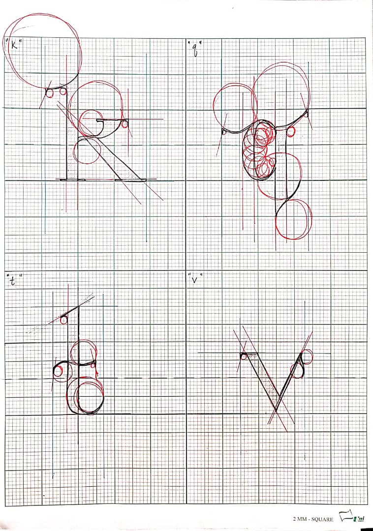
Dissection of individual letters:
 |
| Fig. 1.1 |
 |
| Fig. 1.2 |
 |
| Fig. 1.3 |
 |
| Fig. 1.4 |
Sketches of my own letters:
 |
| Fig. 2.1 |
 |
| Fig. 2.2 |
 |
| Fig. 2.3 |
Week 8:
Further sketches of the rest of the letters we were required to do:
 |
Fig 3.1    |
Week 9:
 |
| Fig. 4.1 I had some trouble at first when some of the letters appeared transparent in FontLab. |
 |
| Fig. 4.2 So I went back to Illustrator and noticed there were multiple strokes in the letters, which prevented me from filling them in properly. |
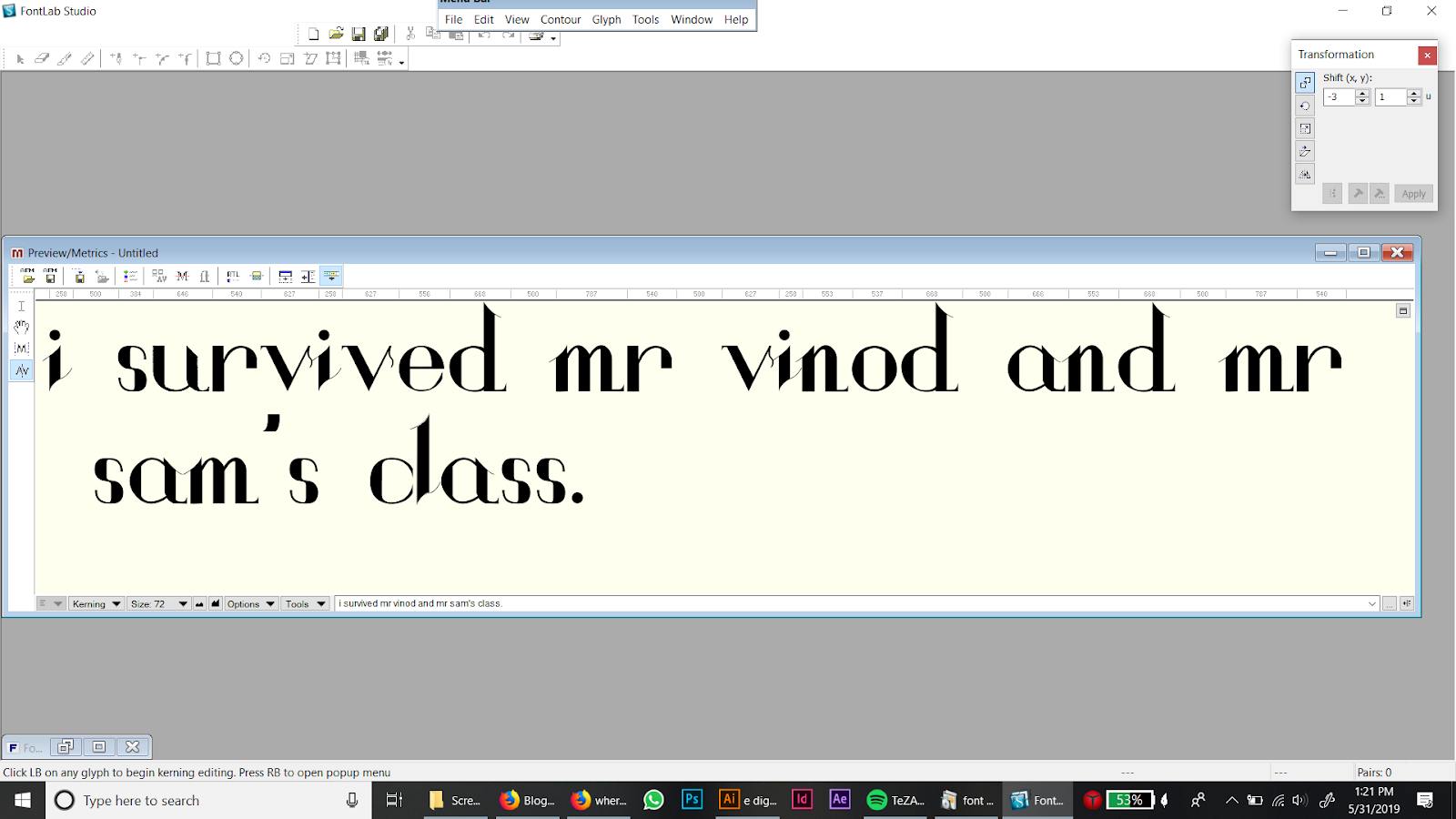 |
| Fig. 4.3 This is the final result. |
Feedback
Week 7: There was no comment on the font.Week 8: Mr Vinod said that my letters look okay so far, just a few minor changes like thickening the thinner lines and avoid using some extra details.
Week 9: On Facebook Mr Vinod said that I should upload my Project 1 as a spread and embed the final as a PDF.
Week 10: Raya break.
Week 11: Mr Vinod said that it is a nice font and Mr Shamsul mentioned that it looks elegant. They suggested that since I put 'survived' in red, I position the text higher than usual, and then center the font name and my name below it. They also mentioned that I should finish all the letters of my font in my free time.
Reflections
Experience:
Week 7: After dissecting letters, I feel like I can understand what letters are made up of easier. It was a bit confusing at first, but as I got the hang of it, I think I know basically what I am doing.Week 8: As I had mentioned earlier in this post, I spent a long time figuring out how to remove the Goodcaster virus. It was really annoying for me due to the fact that it was adware that opened a new tab in Firefox every few minutes to thegoodcaster.com. It slowed down my computer processes and put the USB where I keep all my work in risk. I'd rather not have that experience again.
Week 9: I feel sort of relieved that we only needed to do certain letters and not all of the letters that are required to make up a proper font. I personally think the sentence we had to type out was witty though.
Week 10: Raya break.
Week 11: I am pretty happy with the end result. I still feel like some of the letter need to be fixed, but I have to start work on the final project now.
Observations:
Week 7: I missed out some lines during dissection of letters.Week 8: I tried to download a cracked version of Fontlab and it gave me the Goodcaster virus instead.
Week 9: There were multiple strokes in my letters. I also used brush to fill in letters, which was not what we were supposed to do.
Week 10: Raya break.
Week 11: Some of my letters have slightly thicker lines than others. There were also some which are incorrectly sized, which makes them look a little bigger or smaller than usual.
Findings:
Week 7: I put in lines where it was missing.Week 8: I should be more careful when downloading things.
Week 9: I deleted all the unnecessary strokes and re-digitized some of the letters. It turned out okay in the end.
Week 10: Raya break.
Week 11: I quickly redid the lines. I was not able to work on 'i' so it appears slightly smaller than the other letters.
Further Reading
Week 7:
Understanding typography
Typefaces are basically a compilation of all the letters in a language. When designing a typeface one must consider the style, legibility and readability.
What I took away from this article was the fact that I still have terminologies that I need to remember in order to present my work in a professional manner. I also need to keep in mind that some letters need to be slightly bigger or smaller than normal to make it look like it fits in with the rest of the letters. The line length and line height are also things I need to keep in mind.
Week 8:
Typewriter/Typeface: The Legacy of the Writing Machine in Type Design
Typewriter typeface: once referred to the typeface used for writing in a personal printing machine. It is now used to define the appearance of faces that remind us of those that were used in typewriters.
Some consider typewriter to be a style of typeface.
In the history on typewriters, there were typefaces that were designed specifically for them. Most companies had their own Pica typeface (a monospaced font that fit ten characters to the inch). These were used for typewriting identification. There were other typefaces that were created for other purposes as well, such as protective writing that perforated paper instead of inking it.
Monospaced typefaces came from the limitations of mechanical typewriters. When the typist pressed a key, the carriage moved the paper the same distance each time, so it was easier to return to a previous printing point to make corrections and do tabulation work.
I found it very interesting that there were different typefaces for typewriters. I thought that there were only one standard typeface typewriters use, but as I read through this article, I quickly learned that that was not the case. It is also fascinating to note that the terms 'typewriter' and 'monospace' are not interchangeable. There are typefaces created for the machine with different character widths and some monospaced typefaces with no aesthetic or historical link to typewriters.
Week 9:
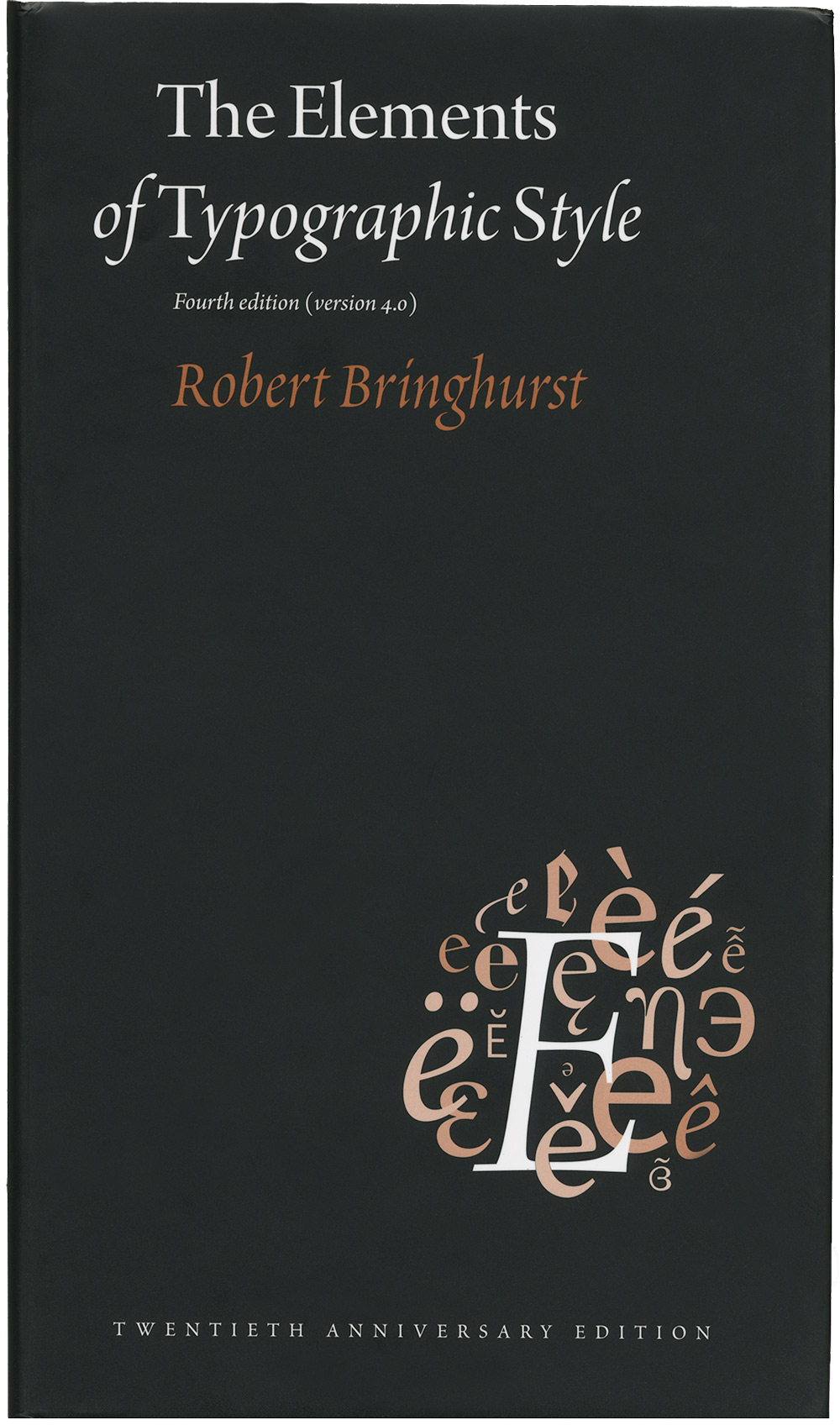
The Elements of Typographic Style by Robert Bringhurst
 |
| Fig. 5.1 |
I feel like, for me, it is great to review the past topics I have learnt in typography class and learn some of it in more detail. Even though it took me a while to fully understand what I was reading, in the end I think it is worth it because my knowledge of typography has deepened by a considerable margin.
“Think of the blank page as alpine meadow, or as the purity of undifferentiated being. The typographer enters this space and must change it. The reader will enter it later, to see what the typographer has done.” - A line from the book.
Week 10:
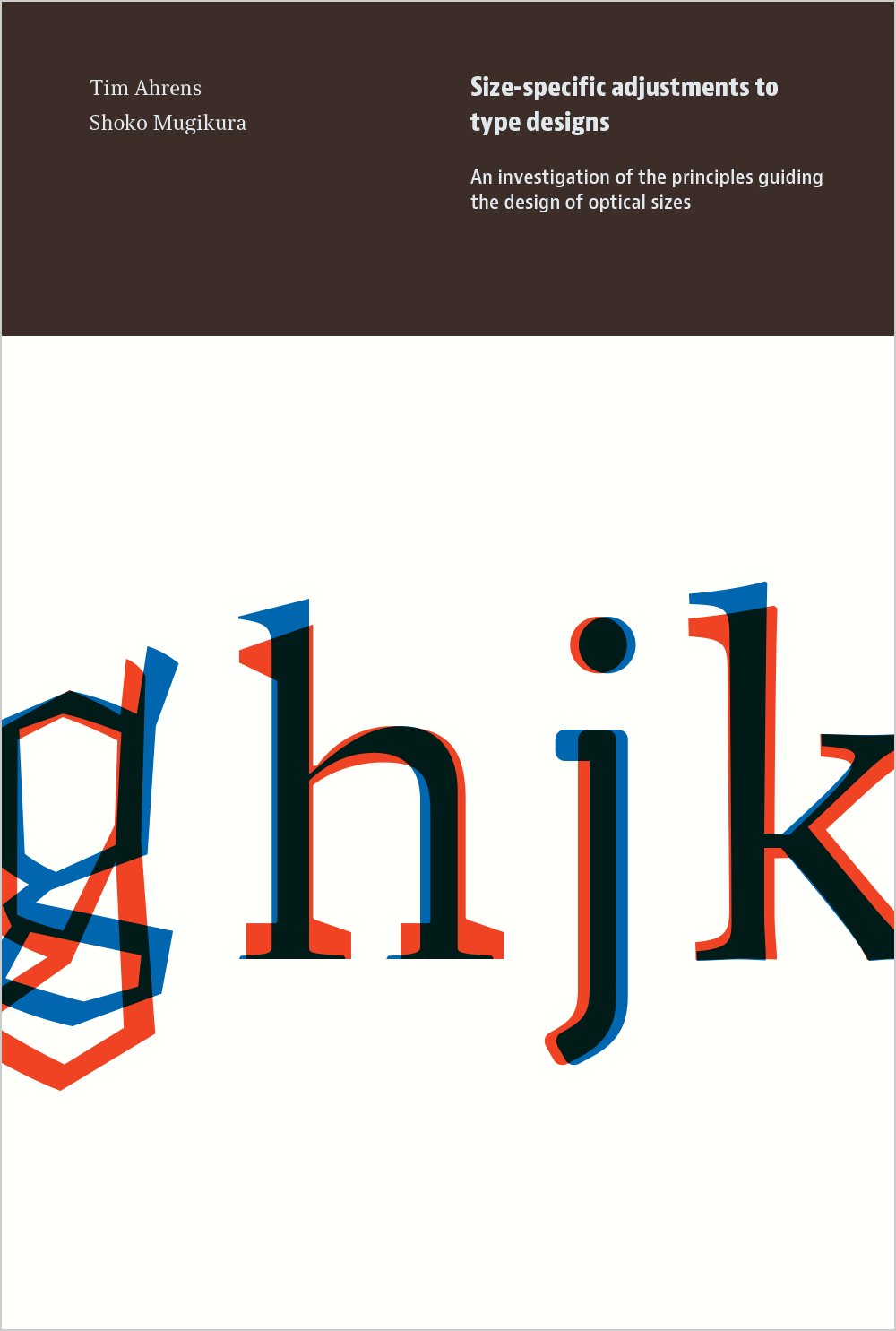
Size-specific adjustments to type designs by Time Ahrens and Shoko Mugikura
 |
| Fig. 6.1 |
This book explains how fonts made for small text look clunky and inelegant when enlarged and fonts made for headlines become anemic and unreadable when reduced for body. Overall, this book brings about the importance of awareness of size-specific type.
This book has two sections - one part containing material on size-specific adjustments, including history, rationale, scientific research, and design advice, and another part showcasing over 100 families with size-specific variants.
Week 11:
Variable Fonts: the Future of (Web) Type by Roel Nieskens
John Hudson summarized an obvious benefit of variable fonts in a clear way in the first line of his introduction to the OpenType variable font spec with "a single font that behaves like multiple fonts."
In the 90s, Adobe named this technology multiple master fonts, but some found it too complex.


Comments
Post a Comment