Advanced Typography: Project 1

23/09/19-07/10/19 (Week 5-Week 7)
Angelina Lee An Qi (0334272)
Advanced Typography
Project 1
Lecture Notes
Lecture 5: Typographic form and contrast
Week 5 (23/09/19):- common region (elements in the same region of space tend to be grouped together)
- pragnanz (things in a manner that makes them appear as simple as possible)
layout (overall appearance of a page)
- spacing can produce a sense of uniformity
- grids brings organisation
- balance gives the page elements some space to breathe
- bullets and number lists make information easier to comprehend
- figures tables and illustration attract a reader's attention by using simple drawings, stylized icons, etc.
creating visual hierachy
- size (bigger text are always read first)
- typeface weight and pairing
- color and tint (bright colors more likely to contrast with muted ones)
- space and texture (more space around elements will attract the eye towards them)
composition ("invisible" elements that contribute to the overall visual effect of a layout)
rule of thirds (focus point isnt predictably placed at the center)
leading lines (our eyes tend to move diagonally across the page in a series of left ot right sweeps)
diagonal lines create depth and perspective
s-shaped lends a fluid sense of movement to a composition
z-shaped structured sense of movement to a composition
find a core characteristic to appear in other letters.
"Idea vs Concept
Often, these terms are used by students and lecturers interchangeably and incorrectly. I would like to clarify its use in this post, in so that moving forward, all of you would be more cognisant when using it.
The following explanation is in the context of our (creative people) use:
An idea is singular in nature. You can have many ideas, but, for them to be considered as ideas, each one must be unique. Hence their singular nature.
A concept is plural. There can be many concepts: of the same type or different. They are generally derived from a singular thought. This thought is represented in the form of an idea.
Meaning: Concepts are derived from a single idea. So every idea you have should ideally lead to a slew of concepts (Idea first, and then concepts based on that idea follows). Each individual idea (tree) produces its own concepts (branches). The better the idea, the more the concepts. I often say say, “a good idea, has legs”.
So henceforth, when you use the terms idea/concept, be cognisant of their meaning before using it in your description or explanation." - Mr Vinod on Facebook.
Lecture 6: Typographic Composition
Week 6 (30/09/19):For this week, my group from week 1's presentation were instructed to present on the topic of typographic composition, including environmental composition, environmental grids, and alternate methods. These are our slides. Unfortunately I was not able to make it to class this week.
I was tasked to research on environmental grids with Daryl. Environmental grids are used in instances where a physical background is used to influence the movement and flow of the type design.
Examples would be:
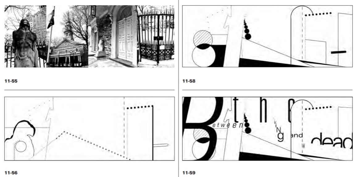 |
| Fig. 1.1 You can see how the designer used a picture of an environment and incorporated into a type design. |
 |
| Fig. 1.2 |
 |
| Fig. 1.3 |
Lecture 3: Typography in Different Mediums
Week 3 (09/09/19):static typography, typography which stays in one place without moving. Most traditional form of typography
- print typography i e the way letters look when they are printed
- screen typography i e the way letters look when they are being displayed on screen
kinetic typography
the art of moving type. Application of motion design to tell stories and evoke emotion through animation.
- motion typography i e uses typographic elements move relative to one another within a 2d or 3d plane but do not necessarily transform into other elements.
- fluid typography
why kinetic?
- eyecatching
- grabs emotion
- deliver info in short time
morphing
- most used technique in motion typo
- complex morphing
- morphing geometric shapes can emphasize the story and create a unique atmosphere
accelerated typo animation
- used to create dazzling visual effect
creative animated letters in static words
- combo of static and animated letters.
storytelling
- using motion to tell story or complement narrative i e lyric videos
environmental typography involves architectural elements such as colors, patterns, materials, images, themes, and messaging to tell a physical space.
3d typography
- produced by maya, cinema 4d, illustrator, photoshop
- has extra depth
- isnt necessarily made for readability
virtual/augmented reality'
vr use of comp tech to create a stimulated environment
ar mixed reality an 'enhanced' version of a real-world environment, opportunity to re-examine typography in relation to our phys space.
research in vr/ar
Instructions
Project 1
Week 5:
Inspiration and examples of what I am supposed to do for The Troublemakers Manifesto: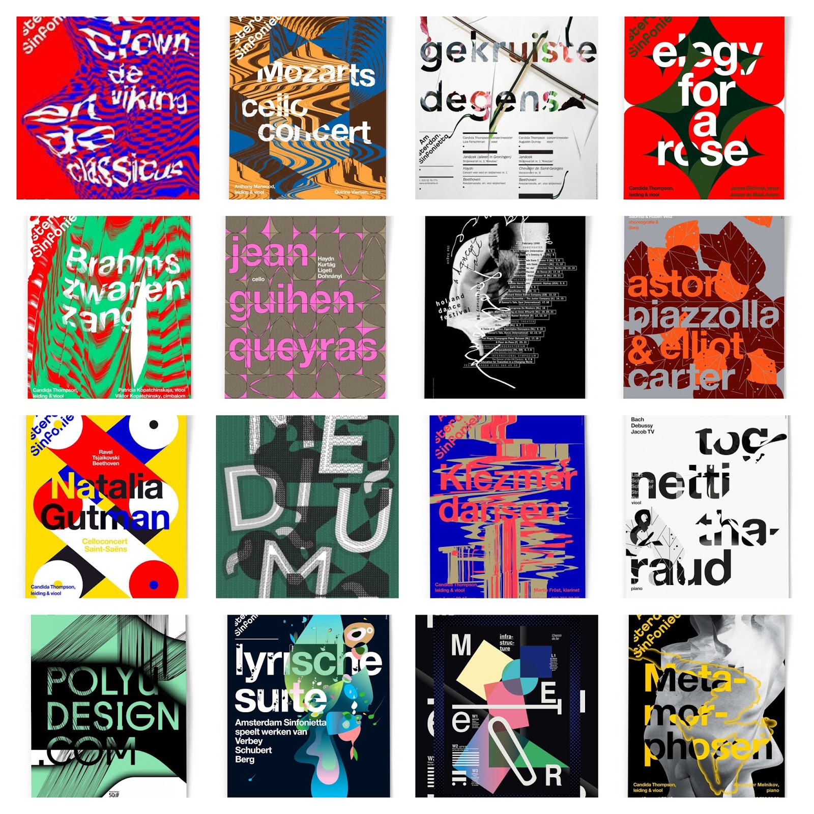 |
| Fig. 2.1 |
Pictures I used to create my drafts:
 |
| Fig. 2.2 |
Week 6:
I created six drafts during this week. Three earlier and three the weekend before class. |
| Fig. 3.1 |
 |
| Fig. 3.2 I tried inverting the colors at first. |
 |
| Fig. 3.3 I later decided against inverting colors. |
 |
| Fig. 3.4 |
 |
| Fig. 3.5 I tried different effects for the text. |
 |
| Fig. 3.6 |
 |
| Fig. 3.7 |
 |
| Fig. 3.8 |
 |
| Fig. 3.9 |
 |
| Fig. 3.10 |
 |
| Fig. 3.11 |
 |
| Fig. 3.12 |
 |
| Fig. 3.13 |
 |
| Fig. 3.14 I moved the letters to let it have more readability. |
 |
| Fig. 3.15 I wanted to use this picture, but then felt like it there was too much happening with the fabric all over the subject's face and the face staring at the viewer. |
 |
| Fig. 3.16 I found an interesting typeface I wanted to try, but I ended up not liking it. |
 |
| Fig. 3.17 A variation of the previous design. |
 |
| Fig. 3.18 I tried to follow the movement of the subject in this design. |
 |
| Fig. 3.19 I thought that "a design colloquium" was too light so I tried another typeface. |
 |
| Fig. 3.20 After trying this typeface, I felt like the previous typeface suited it better so I went back and made two layers of the previous typeface and overlapped them to make them thicker. |
Week 7:
 |
| Fig. 4.1 A black version of my key artwork. |
 |
| Fig. 4.2 An off-white version of my key artwork. |
The PDFs:
Feedback
Week 6: "They all look like covers of a horror movie.
Keep thinking of a better visual idea... also ask your friends what feedback was given to them about their artwork. And what general feedback was given in class." Mr Vinod's online feedback.
I sent three other drafts during the weekend and this was what he had to say: "This shows the most promise. There is a level of creative expression to is that looks ver designer like and the mix of the bw photo looks great, but what does the hand-shadow-window represent in the context of troublemakers?"
Week 7: Mr Vinod told me to convert all the the elements into vector elements and change the background to white. He then told me to convert it so that it can be opened in Illustrator.
"Please dont embed your typpo sys files, use jpg and for final use PDF. There must be captions. Please set your finding type text on one baseline. You have been given a reference to follow, please follow it!" - feedback from Advanced Typography spreadsheet.
Reflections
Experience:
Week 5: I found it hard to get ideas for my drafts, so I searched for numerous examples by European studios. I also found numerous images that seemed fitting to the topic on Pinterest. I felt like I still did not have a clear vision of what I wanted to do just yet.Week 6: I ended up using several of the photos from Pinterest to work on my drafts. I sent in the first three for feedback via Facebook, but Mr Vinod told me that it all looks like the covers of a horror movie, which was not what I intended. I sent in another three and Mr Vinod told me that my last one seemed like it has the most promise, so I felt accomplished, as it showed I improved even if it was just a bit.
Week 7: Minor tweaks during this week. Mr Vinod told me that I should make the background of my sixth draft white, so I did just that. I also converted my PSD file so that it can be used in Illustrator.
Observations:
Week 5: I had absolutely no idea what to do for my design. I thought a lot about the word "troublemakers" but I did not do the same for "a design colloquium".Week 6: I focused way too much into how the letters integrated into the image, and not the actual idea itself. I do not think I paid too much attention to how I communicated the message as well. It was all over the place.
Week 7: There was not much I was worried about during this week. I thought about what products I can do with this design though.
Findings:
Week 5: There was a lot more ways to approach typography than I thought was possible. I did not really think too deeply about it before, but I had never seen any poster like how the professional studios created.Week 6: I found that I still had no clear vision this week. I drafted out as many designs I can.
Week 7: Shirts would be nice, although I feel like a notebook or a tote bag would be more suiting for this key artwork.
Further Reading
Week 5: Modern Typography: An Essay In Critical History by Robin Kinross |
| Fig. 5.1 |
 |
| Fig. 5.2 |
In this situation, all the reformers could really do was to accept the modern machine and give it good typefaces.
I found this article interesting as it gave me some insight into typography, and the transition of traditional typography to new traditionalism. Although how it was summarized here made it seem short, I think that there is still a whole lot more to it than the article gave me.
Week 7: Soft Typography by Christopher Schmandt
Conclusion of this article:
"The combination of algorithmic and hand editing processes described above has been used to create several fonts, both serif and sans-serif, at various sizes, to test grayscale principles, with dramatic results. Characters small enough to display a full page of text remain eminently readable and stable on the screen. The same characters can be easily displayed in color, on either a white or colored background, by mapping the grays into an appropriate color wash.
Particular applications may take this process in one of two directions. The first is to store the font master, and with an appropriately tuned algorithm and fast hardware generate any desired reduction on the fly. The other is to devote time to producing the best possible reductions, and dedicating some form of storage to the final two bit matrices for each font set."
Although this article seems to be outdated, I feel fascinated about how they were able to advance technology along with typography. I like how this article shows things from their perspective, and comparing it to now, I can see how far it has come.

Comments
Post a Comment