Interactive Design: Exercises

27/08/19-08/10/19 (Week 1-Week 8)
Angelina Lee An Qi (0334272)
Interactive Design
Exercises
Lecture Notes
Lecture 1: Introduction to the moduleWeek 1 (27/08/19):
We were given a briefing of what interactive design is about. We were then divided into teams to search for good and bad websites and present the pros and cons of each one in front of the class.
Lecture 2:
Week 2 (03/09/19):For this week, we were divided into groups again, but this time we were to create a simple directory kiosk for testing. Our target audience were parents, visitors and new students, so we were to make the layout easy to navigate.
Lecture 3:
Week 3 (03/09/19):Past web browsers translate differently from modern web browsers. Web designers in the past had to design different layouts for different browsers.
In order to comply with web standards, we have to use CSS and HTML. Used to use Flash, but not anymore because it uses third party elements.
W3C (World Wide Web Consortium) responsible for creating and maintaining web standards and defined all sorts of standards, including standard markup standards.
HTML uses angle brackets </>
CSS uses {}
Javascript uses both {} and ()
opening tag <p>
closing tag </p>
Main elements in HTML:
<head>
<body>
<title>
six levels of headings:
<h1> main headings
<h2> subheadings
If further sections under subheadings then <h3> elements is used and so on until <h6>
For paragraphs, there is just <p>, no <p1> <p2> or <p3>.
ordered list appear in numbers created with <ol>
i.e
<ol>
<li>Chop potatoes into quarters</li>
<li>Simmer in salted water for 15-20 minutes</li>
<li>Heat milk, butter and nutmeg</li>
</ol>
(mostly used in instructions where you list out directions)
unordered list appear in bullets created with <ul>
Project 1 brief:
Create a landing page of any topic. Make sure to communicate the purpose of the site clearly.
Remember a call-to-action button!
Design a web interface in Photoshop and export as !JPEG!
Determine the goal of the website and clearly state which is the call-to-action.
Dimensions in Photoshop: (make a very long landing page going extending horizontally) web > view all presets > web-large (1920x1080)
color mode use rgb!
website must be responsive (aka to tablet or phone)
make sure to add filter
in landing page must have header, body, and filter.
Lecture 4:
Week 4 (10/09/19):For HTML use US spelling.
<!-- (this is a comment) -->
to add any notes
to change typeface call it 'font family'.
block element - each new one is created with a new line. A HTML block is a standard block used to add text, multimedia, widgets etc to a site front page or course page.
in-line elements:
<b>
<i>
<a>
16.22K quality for fast loading
jpeg stands for "joined photographic expert group"
res: 72
file type: jpeg/jpg
choose save for web when exporting!
Lecture 5:
Week 5 (17/09/19):Every HTML element can carry ID attribute.
No two elements should have the same value for their ID attributes otherwise their values are no longer unique.
Must have hyphen for class and id names.
ID and Class attributes by default does not affect presentation of an element unless there is a css rule that indicates that it should be displayed differently.
CSS->Cascading Style Sheet <--These govern how content of specific elements are displayed.
Selectors indicate which element the rule applies to. It can apply to more than one element if you separate the element names with commas. {} Can separate the styles using semicolon ;
p{
font-family:Helvetica,Arial,Futura,Sans-Serif;
color:blue;
}
h1,h2,h3{
font-family:Helvetica;
color:#C0C0C0;
}
# id
. class
Lecture 8:
Week 8 (08/10/19):Responsive web design, method that makes web pages render well on different screens and devices.
- adjust content based on screen, size, platform and orientation.
- not leave out info to fit smaller screens, but adapt content to fit any device.
- achieved with fluid grid concept
Page elements in relative units:
<img scr="photo.jpg" class="img-fluid">
.img-fluid{
width: 100%;
height: auto;
}
How to use media queries:
@media only screen and (max-width: 600px) {
body{
background-color: lightblue;
}
}
Starter template:
<!doctype html>
<html lang="en">
<head>
<!-- Required meta tags -->
<meta charset="utf-8">
<meta name="viewport" content="width=device-width, initial-scale=1, shrink-to-fit=no">
<!-- Bootstrap CSS -->
<link rel="stylesheet" href="https://stackpath.bootstrapcdn.com/bootstrap/4.3.1/css/bootstrap.min.css" integrity="sha384-ggOyR0iXCbMQv3Xipma34MD+dH/1fQ784/j6cY/iJTQUOhcWr7x9JvoRxT2MZw1T" crossorigin="anonymous">
<title>Hello, world!</title>
</head>
<body>
<h1>Hello, world!</h1>
<!-- Optional JavaScript -->
<!-- jQuery first, then Popper.js, then Bootstrap JS -->
<script src="https://code.jquery.com/jquery-3.3.1.slim.min.js" integrity="sha384-q8i/X+965DzO0rT7abK41JStQIAqVgRVzpbzo5smXKp4YfRvH+8abtTE1Pi6jizo" crossorigin="anonymous"></script>
<script src="https://cdnjs.cloudflare.com/ajax/libs/popper.js/1.14.7/umd/popper.min.js" integrity="sha384-UO2eT0CpHqdSJQ6hJty5KVphtPhzWj9WO1clHTMGa3JDZwrnQq4sF86dIHNDz0W1" crossorigin="anonymous"></script>
<script src="https://stackpath.bootstrapcdn.com/bootstrap/4.3.1/js/bootstrap.min.js" integrity="sha384-JjSmVgyd0p3pXB1rRibZUAYoIIy6OrQ6VrjIEaFf/nJGzIxFDsf4x0xIM+B07jRM" crossorigin="anonymous"></script>
</body>
</html>
Instructions
Exercises
Week 1: Analyzing Websites (Group Work)
The whole class was divided into four groups. We were to analyze websites and give pointers on whether they are a good website or not. This is our spreadsheet for it.Week 2: Designing Navigation Kiosk (Group Work)
For this week we were tasked to design a navigation kiosk for our university. This is meant for new students, parents and visitors. We were to come up with a situation for testing and design it on paper. |
| Fig. 1.1 Prototype 1 |
 |
| Fig. 1.2 Prototype 2 |
Week 3: Basic HTML
For this week we were taught to do basic HTML on notepad. This is the link to the website for what I did.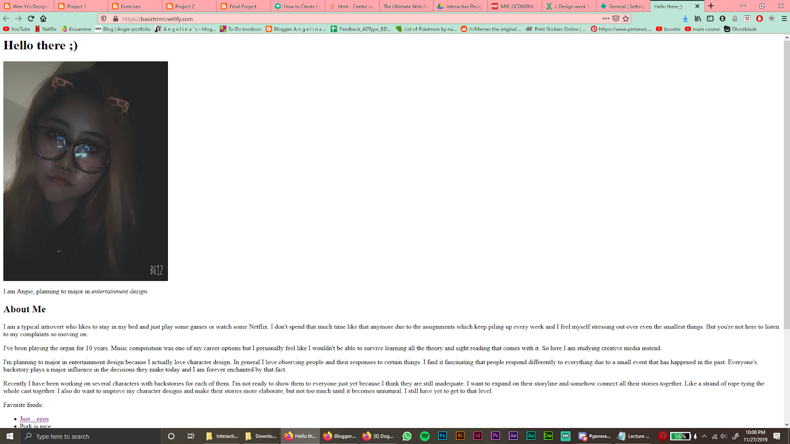 |
| Fig. 2.1 |
 |
| Fig. 2.2 |
Week 4&5: Basic HTML
We were taught basic HTML without CSS during this week. I made a page on 4 types of narcissism. |
| Fig. 3.1 |
 |
| Fig. 3.2 |
 |
| Fig. 3.3 |
 |
| Fig. 3.4 |
 |
| Fig. 3.5 |
Week 6: Layout Exercise
We were directed by Mr Lun to work on a layout. This is the link to what I did. |
| Fig. 4.1 |
Week 7&8: Layout Exercise (Photoshop)
We were given a folder of images and information to work with. It is based on Adobe Photoshop. This is the link to what I did. |
| Fig. 5.1 |
 |
| Fig. 5.2 |
 |
| Fig. 5.3 |
 |
| Fig. 5.4 |
 |
| Fig. 5.5 |
Feedback
Not much feedback because Mr Shamsul just supported us on why we think a certain website is good and what makes it good.Our navigation layout was a bit confusing because we did not make it obvious where to go during the testing. Overall it was an okay layout.
For my Photoshop layout, there was too much empty space. I also have to control the width, and have containers.
Reflections
Experience:
It was interesting because I have never really looked at websites so closely like I did in this week. I feel like in the past I was overlooking website design. Now I think I see why some websites are so nice to use compared to others.I was fascinated because I did not think we would be using paper for our second exercise, especially for a module called interactive design. I think it is a pretty interesting way to showcase a test product.
I found HTML interesting because it was completely new to me.
Observations:
I saw that many websites have a similar layout, with their logo on the top left, navigation on the top, etc. I did not really notice how many websites have that as a standard layout before.We had to redo some of the papers of the kiosk design in the second exercise. There was no margin, and we wanted to layer it underneath a sheet that represents the screen of the kiosk.
Findings:
I think it is because viewers' eyes tend to track from top to bottom and left to right, and because they are so used to that kind of layout which makes for easy access around the website. I feel like it helps the user become familiar to the website faster than if the website were to be in a different layout.We redid the papers. It turned out pretty okay given our timeframe, although I would have preferred if we had some more time to make it better.
Further Reading
Interaction Design Basics | Usability.govInteraction design is basically the creation of engaging interfaces with careful planning. With this, we have to understand how consumers and and technology interact. We have to learn how to expect how someone will interact with the created system, and fix potential problems early as well as invent new methods of doing things.


Comments
Post a Comment