Advanced Typography: Project 2

07/10/19-21/10/19 (Week 7-Week 9)
Angelina Lee An Qi (0334272)
Advanced Typography
Project 2
Lecture Notes
Lecture 7: Typography in Different Mediums
Week 7 (07/10/19):static typography, typography which stays in one place without moving. Most traditional form of typography
- print typography i e the way letters look when they are printed
- screen typography i e the way letters look when they are being displayed on screen
kinetic typography
the art of moving type. Application of motion design to tell stories and evoke emotion through animation.
- motion typography i e uses typographic elements move relative to one another within a 2d or 3d plane but do not necessarily transform into other elements.
- fluid typography
why kinetic?
- eyecatching
- grabs emotion
- deliver info in short time
morphing
- most used technique in motion typo
- complex morphing
- morphing geometric shapes can emphasize the story and create a unique atmosphere
accelerated typo animation
- used to create dazzling visual effect
creative animated letters in static words
- combo of static and animated letters.
storytelling
- using motion to tell story or complement narrative i e lyric videos
environmental typography involves architectural elements such as colors, patterns, materials, images, themes, and messaging to tell a physical space.
3d typography
- produced by maya, cinema 4d, illustrator, photoshop
- has extra depth
- isnt necessarily made for readability
virtual/augmented reality'
vr use of comp tech to create a stimulated environment
ar mixed reality an 'enhanced' version of a real-world environment, opportunity to re-examine typography in relation to our phys space.
research in vr/ar
Instructions
Project 2
Week 7: Poster
 |
| Fig. 1.1 I converted all of the elements into vector elements and opened the file in Illustrator. |
 |
| Fig. 1.2 Mr Vinod told me to reduce the font size and move the words "manifesto" and "a design colloquium" up. |
 |
| Fig. 1.3 |
Week 8: Collaterals
 |
| Fig. 2.1 |
 |
| Fig. 2.2 |
 |
| Fig. 2.3 |
 |
| Fig. 2.4 |
 |
| Fig. 2.5 |
Week 9: Refining Poster, Collaterals, and Mockups
 |
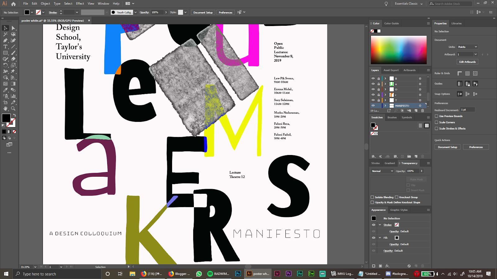
| Fig. 3.1 Final poster corrections (alignment) |
 |
| Fig. 3.2 Mock-up of black shirt |
 |
| Fig. 3.3 Mock-up of a white shirt (back has the same design as the black mock-up) |
Poster:
 |
| Fig. 3.4 Poster |
Products:
 |
| Fig. 3.5 |
The bootstrap microsite for The Troublemakers' Manifesto:
 |
| Fig. 3.6 Landing page |
 |
| Fig. 3.7 About |
 |
| Fig. 3.8 Products |
 |
| Fig. 3.9 Resources |
 |
| Fig. 3.10 Speakers |
 |
| Fig. 3.11 Speakers 2 |
 |
| Fig. 3.12 Contact and footer |
Feedback
Week 8: Mr Vinod told me that the font size of the information was too big. Instead of 44pt I should bring it down to 18/21pt.He also told me that space is not your enemy. He also suggested that the manifesto and a design colloquium can be at the side of troublemakers.Later for online feedback, Mr Vinod told me that my poster design was okay.
For general feedback Mr Vinod said that we need the font size of our information to be 14-18pt. He also reminded us to work on A2.
Week 9: Mr Vinod said that my collateral designs were okay, just that I need to remember to add "a design colloquium" and "manifesto" to them. When I printed out the poster, he told me to align the "lecture theatre 12" to the "E" and the "open public lectures" to the "B". I should also watch for the cutting of the image in the key artwork.
Reflections
Experience:
Week 7: The poster is very similar to my key artwork. I found that it was suitable as it seemed to maintain the impact I was going for. Overall it is very obvious that the two is under the same concept.Week 8: I found working on the collaterals more challenging as I did not really know how to design products based off of my poster. I decided to just stick with, again, a similar design with several slight variations here and there.
Week 9: When I worked on the mock-ups, I was not really sure what to do since everything was very similar. I ended up using a similar design
Observations:
Week 7: I did not want the background of the poster to be pure white, so I made it off-white. I also thought that the image in the poster was not very clear.Week 8: I was not really sure on what to do with my collaterals at first. I tried to experiment with different placements of my key artwork or with different separate elements of my poster.
Week 9: I made the T-shirts the same design but with the colors inverted.
Findings:
Week 7: I found that the image on the poster was not clear, so I changed it.Week 8: While making the collaterals I found out that making my elements with a transparent background is easier to design.
Week 9: I found that with the mock-ups of the T-shirts I could just use any black shirt, cover the original design of the shirt in Photoshop and put my design there.
Further Reading
Week 7: The Effect of Typography on User Experience & Conversions by Tommy Walker |
| Fig. 4.1 |
With good, legible typography, compositions are enhanced. Good typography sets the tone for a composition and is important in conveying the message across.
With a poorly designed composition, it is found that people would have a negative reaction to it. Whereas with a good design, people tend to be more positive.
Week 8: Best Practices Of Combining Typefaces by Douglas Bonneville
 |
| Fig. 5.1 |
- Avoid similar classifications
- Assign distinct roles
- Contrast font weights
- Create a variety of typographic colors
- Don't mix moods
- Contrast distinct with neutral
- Avoid combinations that are too disparate
- Try just two typefaces
- Use different point sizes
Although there are no rules in choosing typefaces, it is helpful to follow guidelines to help you make the best choices for your design.


Comments
Post a Comment