I was hoping to enhance the poster for the movie called Slumdog Millionaire. I want to enhance it because I feel like there is no main focus in the composition. I also want the title typeface to stand out more. However I proceeded to find other ideas.
Week 11: Idea Exploration
Fig. 2.1 Second idea
I
feel like the typeface for the words "delivery service is available" is
not very suitable as it seems to be a rigid and structured type, while
the poster design around it seems to promote happiness with food and
bright colors.
Fig. 2.2 Started searching for inspiration.
Fig. 2.3 Inspiration
I feel like if it was a more carefree, almost
calligraphic kind of typeface then it would suit the message the
restaurant is trying to promote more. However, Mr Vinod told me that it
is not significant enough.
I
suggested to Mr Vinod that I will make a new typeface that is
influenced by ADHD. Then, I will make a poster that promotes awareness
and acceptance of people with ADHD.
It
has been done before by a Slovak graphic designer for 20 different
mental illnesses, but what he did was make 20 different variations of
the same font. He represented each mental illness differently with each
variation. (https://themindsjournal.com/typography-mental-disorders/)
Fig. 2.4 The website about different font variations representing mental illnesses.
For me, I am planning to only focus on ADHD. I feel like if I create a
font that shows how active an ADHD mind is while at the same time has a
solid, balanced structure, I think it would show people that people with
ADHD, although having a different way of processing information, are
still people. That there is no reason to treat people with ADHD
different from the rest.
Week 12: Developing Font & Poster
Fig. 3.1 Inspiration for developing the typeface.
Fig. 3.2 Draft 1 & 2
Fig. 3.3 Draft 3
Fig. 3.4 Draft 4
Fig. 3.5 Draft 5
Fig. 3.6 Draft 6
Fig. 3.7 Draft 8
Fig. 3.8 Draft 9
Mr Vinod told me to work between drafts 6 and 8.
Then I started digitalizing the typeface.
Fig. 3.9 Wanted to make it curved but decided not to later on.
Fig. 3.10
Fig. 3.11
Fig. 3.12 Tried making the letters thicker.
Fig. 3.13 However if I were to have multiple layers, it would not be very readable.
Fig. 3.14
Fig. 3.15
Fig. 3.16
Fig. 3.17 Changed stroke point from 2pt to 4pt.
Fig. 3.18 I had to make my font with one stroke because I could not make the typeface with different layers and different levels of opacity like I wanted, so I decided to create a typeface with one layer and then in the poster I will layer the text.
Fig. 3.19
Fig. 3.20
Fig. 3.21
Fig. 3.22
Fig. 3.23
Fig. 3.24
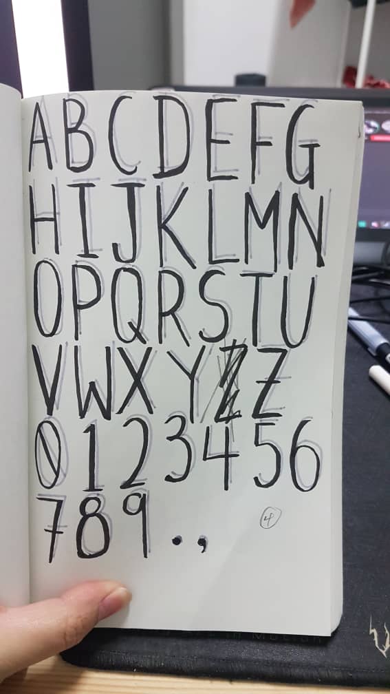
The typeface:
Fig. 3.25 Typeface JPG
The typeface PDF:
The poster:
Fig. 3.26 Poster JPG
The Poster PDF:
Week 13: Revised Font and Poster
Fig. 4.1
Fig. 4.2
Fig. 4.3
During this week I was to redo how I did my typeface and poster. Mr Vinod told me that he likes my drafts, but the way I translated it onto the digital screen was questionable. I also have to research more into how I did the poster.
Fig. 4.4 Research on what to put in my poster.
Fig. 4.5
This video for when I was searching up how to design my poster.
Eventually I found a website that best suited what I wanted to promote. It was coincidental that ADHD Awareness Month was October 2019.
Fig. 4.6 The website I found.
Fig. 4.7
Fig. 4.8 Process of the poster.
Fig. 4.9
Week 14: Submission
The typeface "Fidget":
Fig. 5.1
The typeface PDF:
The poster:
Fig. 5.2
The PDF:
Feedback
Week 11: Need to upload the PDF of the flat-lay, screen capture of the website with the URL. Mr Vinod told me to remember that I am not redesigning the poster but rather enhancing the typeface used. I need to find more ideas.
"So how is “a mere font” that you develop expected to increase or create awareness/understanding/acceptance amongst people re ADHD? Is there an instance where a font has done so for a different affliction?
The passage you quote from the brief refers to a TYPOGRAPHIC problem in you area of interest (Graphic Design/New Media/etc). I.e. The government presently uses ARIAL typeface in formal letters and I believe the typeface isn’t suitable for the Malay language as the words in Malay are long and as such it is probably better to use a slightly gothic or condense typeface. To ensure a unique identity, I propose the creation of a typeface for the government 👈🏽 example of identifying a problem (area of interest GD) and making the case for a better typographical solution." - Mr Vinod via Facebook.
Week 12: "Last one I like the idea of the thinner line at the back but what it’s missing is hyperactivity and a little more movement with the letters." - Mr Vinod on Facebook. I sent another three attachments and this was what he commented on two of them: "Somewhere between these two. The first one (the background lines gives the impression of anxiety or hyperactivity) but I like the front strokes of the second image. You figure out the rest and make it work." Mr Vinod when I messaged him on Facebook.
Week 13: Mr Vinod told me that I should, instead of showing the letters of my typeface with different opacities (since I cannot do that in Fontlab), I vary the thickness of the strokes. He also told me to not make the typeface too rigid, as I made it kind of playful in my drafts. He also told me to do more research on posters. There is no problems with my blog however.
Reflections
Experience:
Week 10: I had no idea what to do during this week. I felt like I was dry out of ideas and I did not know what to do despite looking through seniors' blogs and some of my friends' work and rereading through the assignment brief.
Week 11: At this point I was stressed out to find an idea by this week. I opted to look through Pinterest as well to search for ideas.
Week 12: I finally got my idea approved and immediately started working on the drafts. By this time I was already panicking to get the work done.
Week 13: I redigitized the typeface so that it would replicate more of what I did on my drafts. I also tried to find as many poster references and websites on ADHD as possible. I felt like I had a better idea of what I was doing compared to previous weeks of working on this final project.
Observations:
Week 10: I did not put in much effort during this week mainly because I focused on other subjects.
Week 11: I could not think of any ideas although I went through several seniors' blogs.
Week 12: As I got my idea approved, I quickly worked through my drafts. I originally wanted to make my font more curved.
Week 13: I was unable to find what to put on the poster for a while. I was thinking of putting quotes but then I feel like I do not have enough references to back it up.
Findings:
Week 10: Later I did feel the effects of putting off my work.
Week 11: Finally, I stumbled upon several posters of ADHD and how October was ADHD Awareness Month. So I decided to do something that promotes the acceptance of people with ADHD into society.
Week 12: Later I felt like I should not make my font curved and changed everything to fit as consistent as I could.
Week 13: Coincidentally ADHD awareness month was in October this year. I made a poster promoting it by adding a statistic that debunks an ADHD myth that says that children grow out of the disorder once they reach adulthood.
Papyrus is fundamentally a strong and solid typeface. However, it is also materially dishonest. Material dishonesty is a concept that states how a material is made to look like something else. Papyrus is made to mimic a nib of a pen over paper, which sometimes breaks in between, thus making the rough edges of the font. It is just a suggested outcome of how writing would turn out if you manually calligraphed on paper.
“A creative person experiences the order and structure
that others find comforting as inhibiting and even suffocating… he feels
the need to escape into a richer and more nuanced ‘borderless grey.’" This freedom lets them enter into a trance, or a state, where their creative senses are heightened and their productivity fluctuates. However it is important not to put people with mental illnesses on a pedestal. They are not repressed creative prodigies. The art of creating may be an outlet for them, where it is a means of self-expression.


Comments
Post a Comment